Donesafe helps organizations to modernize technology, simplify processes and make smarter decisions that drive safer, sustainable, and smarter workplaces that stay ahead in a fast-changing world.
Discover the world’s most intuitive cloud-based EHS software that transforms health & safety culture, and drives worker participation and leadership.
Explore world-class technology engineered to control, manage and comply with all your risk, governance, regulatory compliance, and workplace obligations.
Managing physical SDS copies is more than a storage hassle – it’s a constant challenge to keep them organized, accessible, and up-to-date.
With HSI Donesafe, you can take a proactive approach by identifying, assessing and managing psychosocial hazards.
End-to-end quality and supplier lifecycle management, designed to meet all your compliance and continuous improvement standards and drive operational excellence.
Take control of your entire organizational ecosystem by connecting your workforce, assets, and your environment to exceed your sustainability benchmarks.
Catalog, manage, inspect and audit a wide range of assets including PPE, tools, software and vehicles.
Capture, track, investigate and report on all incidents and near-misses.
Meet compliance obligations and automate organizational audit management protocols.
Full spectrum injury claims management including correspondence, investigations and Return To Work.
Records, track and manage qualifications, meet compliance requirements and automate notifications.
SCORMcloud compatible management of competency, e-learning and training requirements.
Manage the full spectrum of change within a controlled environment with full audit trail visibility.
Register for logging non-conformances, with a full investigation framework and corrective action plan.
Create customized online checklists to automate safety and operational behavior, and inspections.
Meet regulatory, license and permit requirements, assign owners and monitor corrective actions.
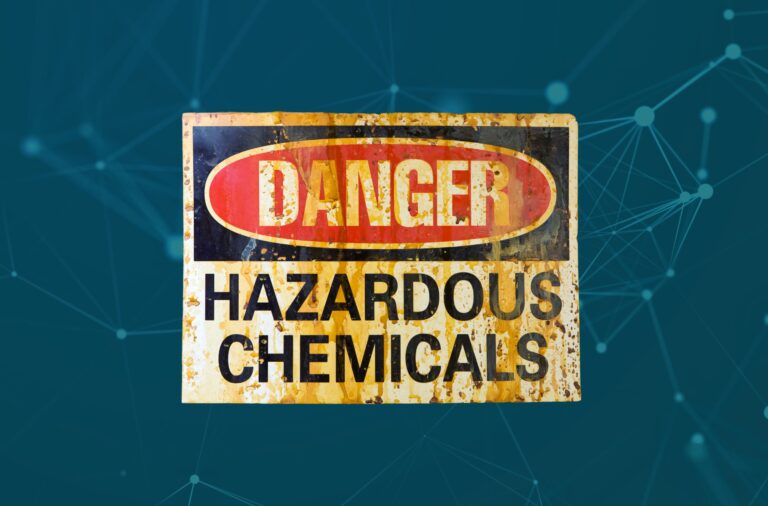
GHS compliant management of Safety Data Sheets, dangerous goods and chemical status.
Streamlines capture and assessment of safety and behavior-based observations.
End-to-end management of contractor approval, registration, insurances, licenses and site inductions.
Centrally manage the contractor workforce and oversee required permits and licenses.
Link corrective actions to findings and causal factors, set priorities and automate workflows for fast close-out.
Single-source project oversight including automated assignment, task scheduling and obligation tracking.
Oversight and control of key operational and compliance documentation, such as ISO 9001
Curate a central repository for SWMS, leverage customized templates and automate related workflows.
Conduct random testing, manage third party testers, capture results and communicate with the lab.
Manage real-time hazard alerts, assign key safety lessons, and provide updates via dashboard and email.
Complete emergency program management including preparedness, drills and inductions and personnel.
Schedule, manage and track safety meeting follow-ups, and link to other Donesafe modules.
Control the purchase, registration, assignment, repairs, servicing, invoice and inspection of your fleet.
Streamlined workplace tracking of vaccination and testing status in a centralized, secure platform.
Complete hazard lifecycle management, from logging, to corrective actions and close out.
Register, track, ensure compliance and assess performance of your vendor and supplier base.
Trust the only platform designed from the ground up to simplify experiences, empower adoption and transform organizational culture.
Drive superior organizational visibility, employee engagement, and improved compliance through Donesafe's highly adaptable, configurable and interoperable platform.
Design, execute, manage and optimize all your enterprise processes & procedures across the entire workplace on a single, purpose-built platform.
Initiate positive, transformational change with the platform that supports ultimate configurability, maximizes simplicity and generates actionable insights across your organization.
Let Donesafe empower and connect your workforce, through powerful automations, smart workflows, real-time intelligence and superior compliance.
Discover the benefits of an integrated universal EHS management system designed to meet all your current and future needs.
Run your EHS program on the most advanced next-gen EHS software that instantly connects everyone to everything.
WH&S (Workplace Health & Safety) software helps organizations to proactively manage workplace risks and compliance, reducing incidents and improving the health and safety of their employees.
Partner with the platform that delivers superior organizational oversight, flexibility and control.
Unify the management of people, assets, systems and environments under a single, modular platform.
Donesafe delivers best-in-class employee adoption and engagement for a safe, compliant workplace.
Reduce point solutions and simplify your tech stack with a secure, single-source EHS & ESG platform.
"*" indicates required fields
Please wait while you are redirected to the right page...